Introduction
Here we will look at the effects of changes in selling price, fixed costs, and variable costs on the net income and break-even point.The use of graphs can also help us with break-even analysis.
We usually call the graph showing the total revenue and the total cost graphs together a break-even chart.
This chart is an easy visual way to analyze the financial position of a business for different number for units
sold (sales volume) or produced (volume of output).
We can see at a glance the amount of profit or loss that is generated for different levels of sales or production.
Net Income and Volume of Output
Example: The unit variable costs are $30. The selling price of the unit is $60.The capacity for the period is 200, and the fixed costs are $3000. Question: What is the net income at a volume of:
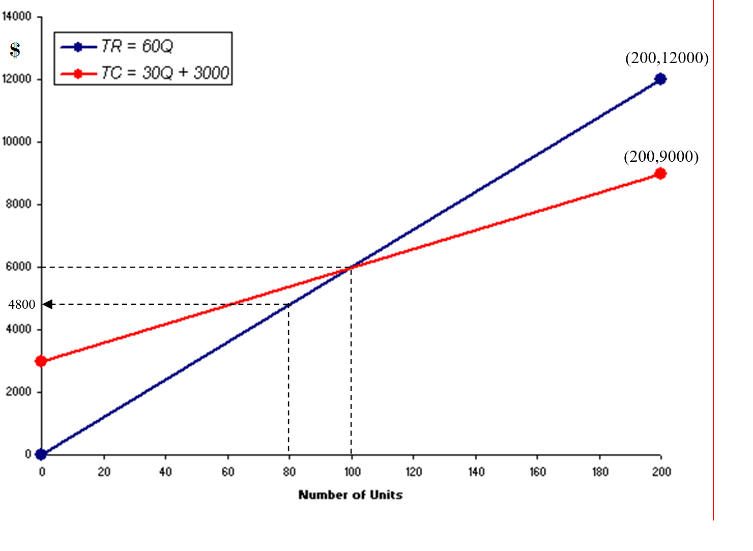
Scenario 1: 40% of capacity?
Solution:Q = 40% of 200 = 80 units
TR = SP × Q = 60 × 80 = $4,800
The graph below shows the drawing of both equations: TR and TC:
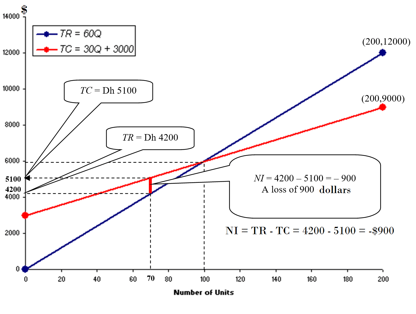
The next graph shows that based on the current situation, the business is incuring a loss of $600.
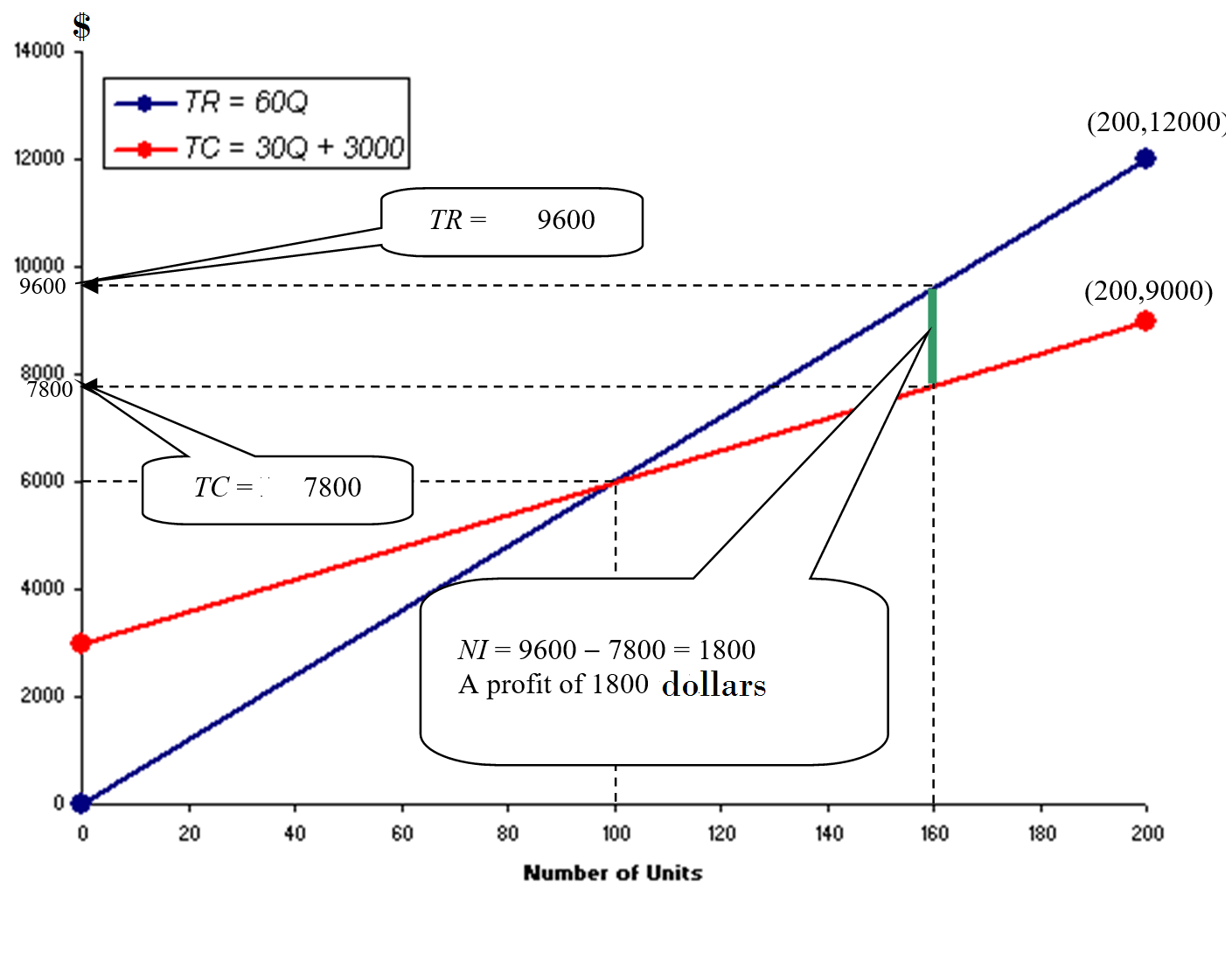
Scenario 2: 80% of capacity?
Solution:Q = 80% of 200 = 160 units; TR = SP × Q = 60 × Q = 60 × 60 = $9,600
The graph below shows the drawing of both equations: TR and TC:
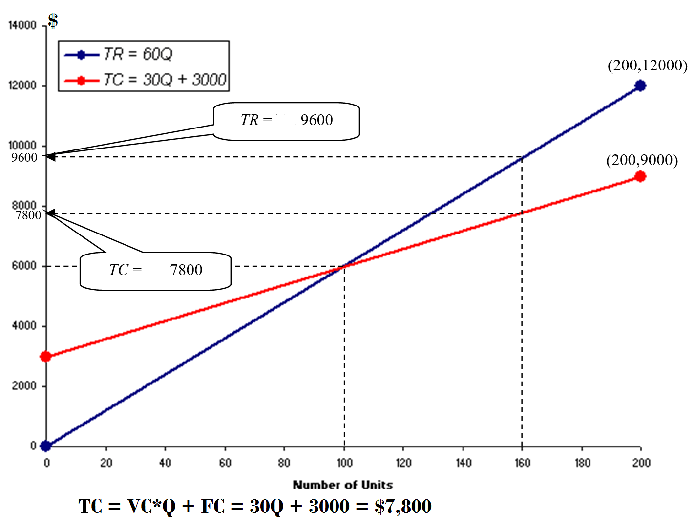
The next graph shows that based on the current situation, the business is incuring a profit of $1800.